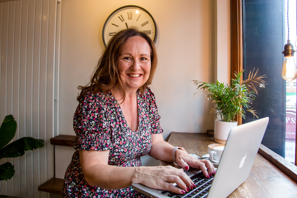
How to create a website that brings in more business
Making a few small tweaks to your website can significantly improve your sales from customers if you do it in the right way, says website designer Marie Brown.
Here’s how:
- 1. Know exactly who you are targeting and what your message is
Marie says: “It is amazing how many businesses will say, well I want to target everybody. That might be the case but your message is going to be much more effective if you can target it to a specific demographic, because then you can get your website to reflect that. If you are targeting women over 40, for example, you can make sure your images on your website are all of women of that kind of age. If the demographic is wider then you need to think about what they have in common and ensure that your messaging is around this. For a service-based business, for example, this might be a common pain point that they all have, that you can solve for them.”
- 2. Use great photos
Marie says: “Make sure you have good quality images because they set the mood and the tone of your business before people read the words. Ideally they should be taken by a professional who understands the kind of photographs that you need. If you are service-based business then you need a brand photographer; if you are a product business you need a product photographer. They need to be mostly landscape rather than portrait size and you might also want some banner images which are quite wide and not very tall.”
She adds: “Make sure the photographer understands the poses you might need. There is a move away from formal headshots to pictures of people in action, because it enables customers to warm to you and think what it would be like working with you. Make sure you also have photos that relate to your industry - for a wedding business, for example, you might have photos of a champagne glass, or some flowers. Make sure too that the colours are coherent and reflect the colours of your brand.”
- 3. Make sure the layout reflects the customer journey
Marie says: “One of the mistakes businesses often make is they don’t provide a route through their website. Instead they let people wander around it unguided. That means people don’t necessarily follow the journey that makes sense from a sales point of view and so they don’t know what to do or what they should be doing next. People don’t have time to go wandering around your website, so you have got to make it easy for them. If you have a product-based business, for example, put a ‘Buy Now’ button on your home page to give people the option of going straight to the shop. Then you can divide the products you sell into different categories so people can easily find what they are looking for.”
“If you have a service-based business, use your home page to sub-divide people into groups by creating different boxes for each category of person who might be visiting your website. Then you can create different journeys through your website, depending on which initial box someone clicks on. The boxes act like signposts, directing people where to go next so they reach the end point – whether that be booking an appointment or making a purchase – in the fewest possible steps.”
- 4. Use the right words to show you understand your customer
Marie says: “Particularly with a service-based service, you need to empathize with somebody about where they are now, and to show you understand where they want to get to. If you are a weight loss coach, for example, you need to show that you understand what it is like when your clothes don’t fit, or when you are faced with a choice between a salad or a doughnut, and that you understand what it is like for that person. Then you show them what their life could be like with your help, and that you are the bridge across to that new life. Use testimonials and case studies to show how you have already helped someone in a similar position to them.”
Three things you can do right now
1. Look at the very first image on your website and see whether it gives the impression that you want people to have of you and your business.
2. Make sure the first words at the top of your website explain clearly what you do because people don’t have time to waste working it out.
3. Make sure the testimonials you include are from the same kind of people that you want to target.
Marie Brown is the Founder of website design company Beyondthekitchentable.co.uk.


